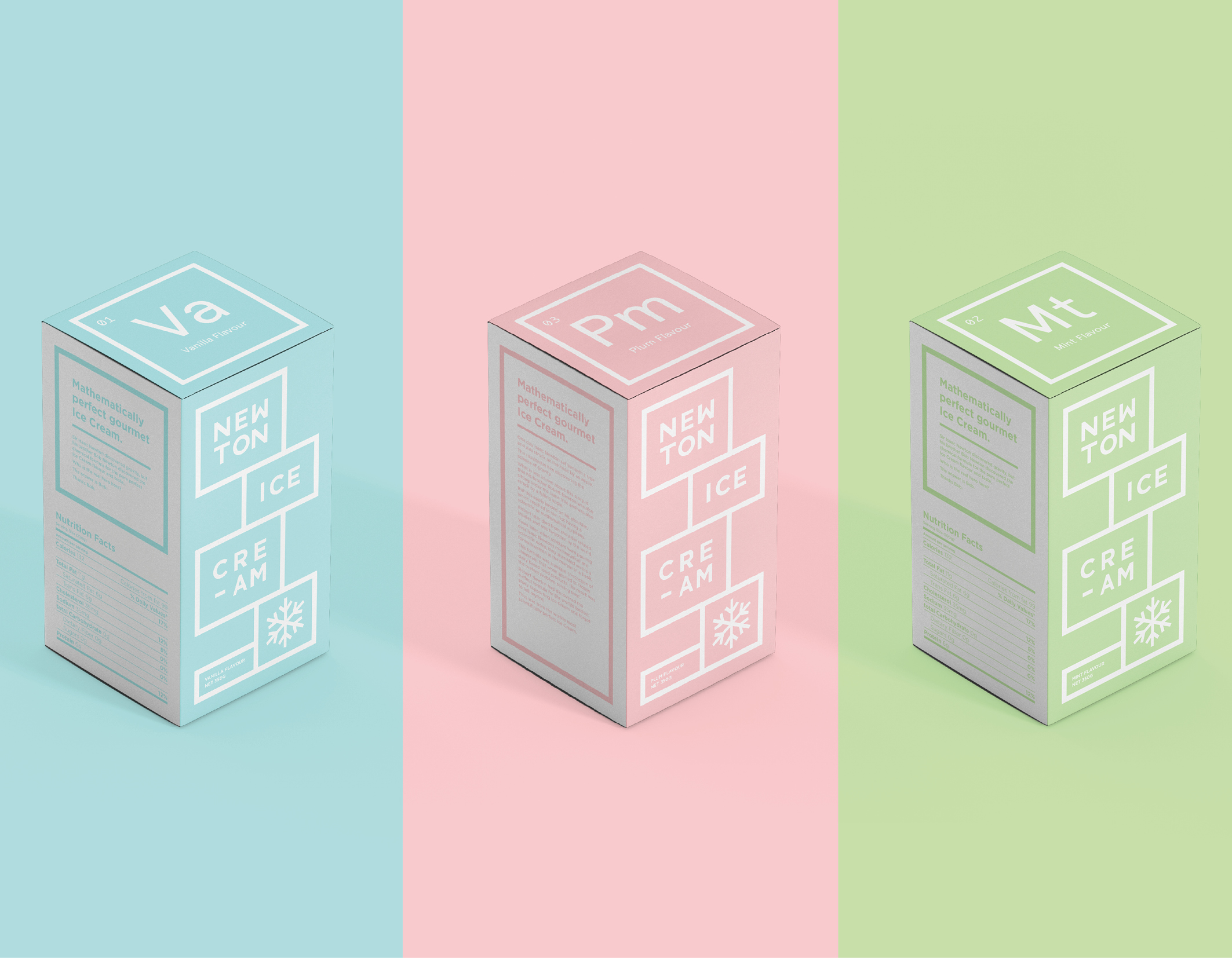
Newton Ice Cream is a start up ice cream Company aiming to target environmentally conscience people with a sense of humour.
The brief I set out to achieve was to create a unique, eye catching design for the Newton Ice Cream packaging which would allow it to stand out from its competitors. The push of this product is that it is ‘mathematically and scientifically the perfect ice cream’. Though there is no strong proof to support this statement, the overall messaging and design of the ice cream containers suggests that it is all a bit tongue in cheek. With science and maths is mind, I chose to draw inspiration from the grid design of the periodic table, and create a ridged grid structure for the design elements to work within. The overall design is quite minimalist in its finish, allowing the product and message to stand confidentially for itself.
Below are a few mock up examples of the package design.


